Archive
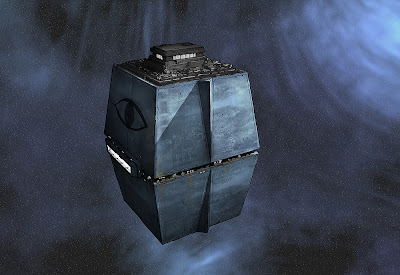
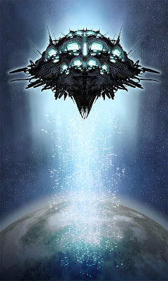
space opera: Galactic Imperium Orbital Station N-128
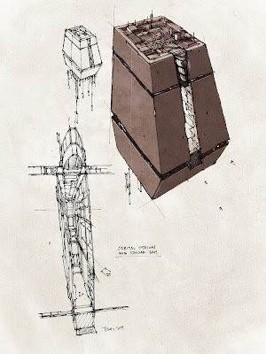
A finalized design, finally. Well, probably still time for some tweakage. Wanted to get some of that 70s era, Joe Johnston/Nilo Rodis-Jamero practical model feel for some of these ships and outer space locations. The earlier concept sketch is at the bottom. Originally I had a vertical slit for the main hangar space, but that was not going to be practical for the scenes taking place in there.
space opera: Cygnus Lake
Character sketch of one of the leads. Originally she was written as a cyborg, but reading over the script I don’t know that it really adds anything to the story.
remixed piece
Pardon the forthcoming mental diarrhea.
One of the things I’ve always tried to do with concept design work is to provide as clear a read as possible. To me, this has meant eliminating extra (unnecessary) information, clarifying the intent of the design as much as possible, with the idea that the main purpose is to guide someone else in creating a 3D asset. In that kind of mind set, the concept art is not the end, but simply one step along the way to the end. It’s a documentation of the desired end product, but it is not the product itself.
Illustration is a different kind of thing. As the one holding the pencil (or brush, stylus, whatever your deal is), that thing you’re creating is the end product. That being the case, a clear, efficient read isn’t necessarily always a requirement. Meaning, you’re no longer writing a visual instruction manual for someone else to build something.
Good art seems to be about being different things to different people – depending on what’s going on inside your head, what you get emotionally from a piece of art will be different from what the person next to you gets out of it. I’ve always tried to maximize the “signal to noise” ratio in my concept art. See that stuff about “clear read” above. In illustration, it may be that “noise” can be made into “signal.” By having many layers, textures, noise – there are more opportunities for meaning to arise from the art. Not necessarily “meaning” in terms of what the artist intended, but that might come from the act of a viewer looking at a piece of art and responding emotionally to patterns, lines or forms in ways that only that particular person can.
In the past I’ve made the comparison between concept artists and actors. Some concept artists approach their work similarly to good character actors. They are able to suppress their own voice in order to play a role that best supports the project they are working on, and you are never really conscious of CONCEPT ART. Same way that really good visual effects are not obvious, or how a lot of times it’s difficult to remember the names of those good character actors. These concept artists are able to design appropriately for any time period, genre, mood, etc. Other concept artists are more like blockbuster movie stars. They do a certain thing really well, are well known for it and are hired to do that thing on someone’s project. As in movies, there’s definitely a market for those guys too.
As a concept artist, I’ve always strived for the character actor route, which means I’ve always attempted to eliminate any individual mannerisms or idiosyncracies in my art as much as possible, in pursuit of that “clear read,” and to serve the project. Of course, as much as you try you’ll never completely eliminate those personal artistic twitches. As an illustrator, I want to figure out exactly what those things are, and bring them back and refine them in my illustration work.
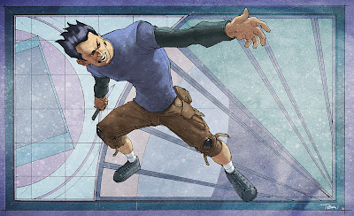
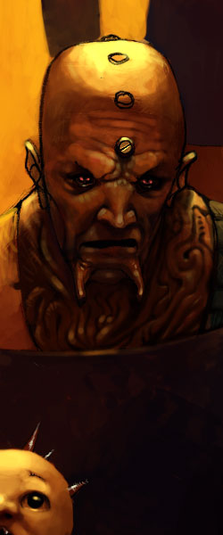
So all that verbiage was meant to set up this image, which is a remix of a digitally painted sketch from several months ago. My formative years as an artist (starting from say age two to about age 28) were spent with pencil and paper, and I think that a good portion of my artistic “voice” comes from that pencil, paper and linework equation.
space opera: Federation Outpost Docking Bay
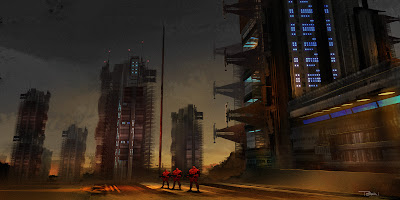
space opera: Planetary Federation Outpost
Here is a shot of the Planetary Federation outpost from which the rescue mission to retrieve Vitaly Fentonov originates. I’ve placed a few Galactic Imperium troopers in the shot for scale, but story wise they would not be present here.
space opera: Uvei Mortis’ Battle Cruiser
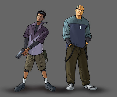
space opera: Todd Almeida & Nathan Masato
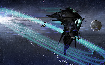
space opera: translight jump
Hm OK I’m not sure I’m calling this done. My judgment is not 100% this time of night, but here it is for now…
