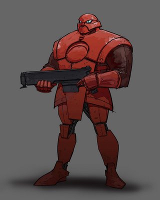
This guy stands about 8 feet tall, and is mostly mechanical. Red is the signature color for the Galactic Imperium; for basic grunts like this guy, red will be a major element in the design. For higher ups like Uvei Mortis, red will play a much more subtle role in the visual design. For scientists and middle management types like Fentonov, the red will be more of a 50-50 design element.
Oh yeah, and this is obviously a revised/refined version of the sketch I posted of this guy a while back.

character design, space opera
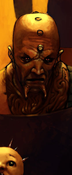
Vitaly “Adam” Fentonov is a Scientist Top Grade, working for the greater glory of the Galactic Imperium. He was recruited by the Imperium as a young scientist while still in the Academy, and has been a loyal Imperium subject ever since. Lately however, Fentonov has grown increasingly dissatisfied with the politics of the Imperium, especially in the case of its treatment of artificial life, which is one of Fentonov’s specialties. He probably would have defected to the Planetary Federation already were it not been for the fact that his beloved daughter Isolde remains a loyal Imperium subject.

character design, space opera
Captain Todd “The Todd” Almeida complains to his friend Nathan Masato about being paired up with a certain pilot for a retrieval mission.

space opera
Well, if you could see them fly, you’d know which end was the front. Dammit.

space opera, vehicle design
Just some more experimentation, maybe a bit of character study…

character design, comic books, space opera
This is a sort of test of the look and feel of this space opera comic book project. By the way, to answer the question that some of you had about the previous post, my intention is to make another comic book short story, except hopefully this one will be good. I decided that in order to pull that off, I probably really ought to bring in someone who actually knows how to write an interesting story and characters. So ideally, between the writer and me we can come up with a cool, exciting story with some decent visuals to go along with it.
Anyway, at the moment we are still in the early stages of character development. I have some ideas and general things I’d like to see, but the ball is pretty much in Stephen’s court. My focus at the moment is to refine the look and feel of both the universe and the actual graphic style of story. I’ve been trying a few different tricks with the previous posts, and I think I’m starting to narrow in on a particular look for this book. It’s a combination of drawing and painting styles mixed with a few digital filter and layer tricks.

comic books, space opera
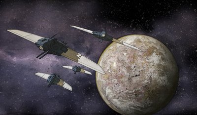
Here are a couple of quick render/illustrations of some small fighter space craft based on the sketches in the previous post.


space opera, vehicle design
Hello again, sorry for the absence – had quite a bit on my plate there for a few weeks. Still do really, but I wanted to put at least a few minutes into this space opera project. I’ve been working with a writer named Stephen Phillips, who is doing a great job with helping me establish the world and the main characters. I think his ideas and script writing ability will help this thing out a lot!
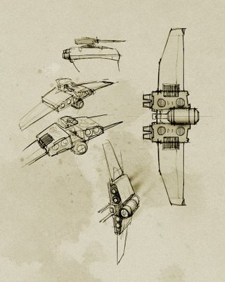
Anyway this is just a set of really really quick and dirty sketches, starting to create the characters of the ships in this story. What I’d like to do is give the ship designs a bit of that old school, “practical model” feel. There is a certain aesthetic that comes from having to build actual models for the science fiction movies of the 70s and 80s that you don’t always see in the cg models in movies nowadays. The way I interpret that is that the ships start off with some very simple geometric shapes, which create an easily identifiable silhouette – you can immediately recognize a TIE fighter, for instance, regardless of the angle at which you are looking at it. All the “greeblies” are applied as a secondary layer, rather than acting as the main idea of the design.
So for this guy, I was thinking about a rotating cockpit, so that the orientation of the ship could change on the fly. So to speak… it would land and take off in a horizontal orientation, kind of like the old Cylon raiders from the original Battlestar Galactica TV series. Once in the air, or in space, the cockpit could rotate around 90 degrees and the ship would then take on a vertical orientation. No practical reason, just kind of a cool look. And so I wouldn’t be dinged for doing a Cylon raider ripoff. Which it still sort of is I guess…
Yadda yadda.

space opera, vehicle design
Meanwhile, at the Planetary Federation Shipyards in a hidden quadrant of space, the Federation Frigate “Marian’s Path of Righteousness” returns for refueling and repairs. Marian’s Path was involved in a covert operation to aid the famous roboticist Adam Fentonov in his defection from the Galactic Imperium, and suffered some minor battle damage.

space opera, vehicle design
The Galactic Imperium long range cruiser “Hammer of Romulus” on its reentry into the atmosphere of Cygnus X-1, the Imperium homeworld.

space opera, vehicle design
